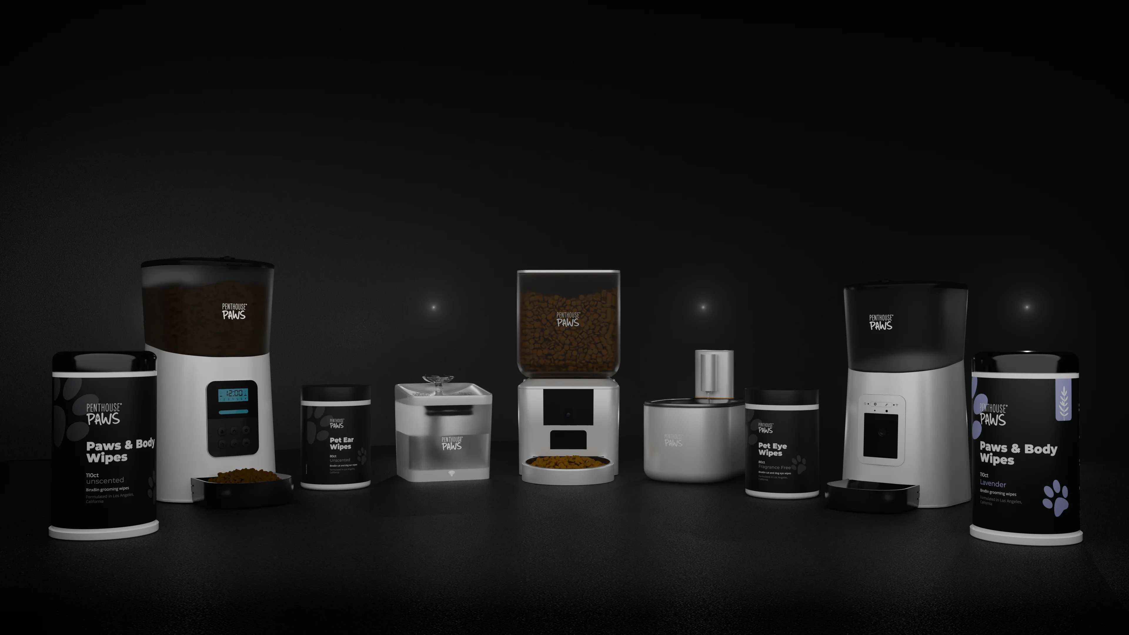
Thirty colour variants of one product is one scene, one lighting rig and a spreadsheet. It isn't thirty scenes. Set up properly, a full colour range renders overnight while I sleep, and adding colour number 31 next season costs about ten minutes of my time plus the render itself.
The setup is where the work goes. Here's how I do it, and where it bites.
One scene, with materials named by part
The first thing I do with any product that comes in several finishes is rename the material slots. Not "Red plastic" and "Grey rubber" but "body", "trim", "button", "logo", "stitching". A material named after a colour is wrong the moment the colour changes, and by variant twelve nobody (me included) remembers that "Red plastic" is now sage green.
Then I split the product into what changes and what doesn't. On a typical consumer product maybe three of nine materials vary between SKUs. The screws, the display glass, the rubber feet and the charging contacts stay put, so those get locked and I stop thinking about them.
The variants themselves live in a table: one row per SKU, one column per changing part, plus a column for the output filename. In Blender I read that CSV with a short Python script that assigns the colours, sets the filename and queues the frame. KeyShot does the same job with its configurator and model sets, no scripting needed, which is one reason I still open it for simple hard-plastic products.
Why a table and not thirty saved files? Because someone will ask for softer shadows after seeing the first five images, and with thirty files that's thirty edits. With a table it's one.
Getting the colour right is harder than picking it
Clients send colours as hex codes, Pantone numbers, RAL numbers or photos of swatches. Each one has a trap in it.
A hex code describes a colour on a screen, in sRGB. A renderer works in linear light, so the value has to be converted on the way in. Blender's hex field does that for you, but type the same numbers into the RGB sliders and you get a washed-out, too-bright version of the colour. I've seen whole catalogues rendered that way.
The second trap is the view transform. Filmic and AgX in Blender are built to make bright scenes look photographic, and they do it by compressing and desaturating strong colours as they get brighter. Lovely for an interior. Bad for a packshot where the orange has to be the brand's orange, because a saturated orange drifts pale and slightly yellow in the highlights. For colour-critical product work I switch to the Standard transform and control the highlights with the lighting instead.
Third: the lights. A warm key light at 4,500 K pulls a neutral grey product towards beige, and no amount of correct hex codes will fix that. I light colour ranges with neutral white light and put a mid-grey card (0.18 albedo) in the scene for a test frame. If the card doesn't read neutral within two or three RGB values, the rig is tinting everything and I fix the rig, not the materials.
Pantone and RAL are easier in one way, since they're real references with published screen equivalents. They're harder in another: a render on a monitor will never match a printed chip exactly, and it's better to say so before the first proof than after. What I aim for is that every variant reads as the right colour when it sits next to its siblings on a product page.
Photos of swatches are the worst input. Last year a maker of upholstered beds sent me fourteen fabric colours as phone photos taken on a kitchen table under a warm bulb. A photo under a 2,700 K bulb tells you almost nothing about a grey-blue fabric, so I asked for the fabric supplier's reference codes and matched from those. It took one extra email.
Black, white and metallic need their own treatment
White plastic reflects roughly 80% of the light that hits it. Black plastic reflects about 4%. That's a twentyfold difference under the same lamps, so a rig tuned for a mid-grey product will clip the white variant (the edges vanish into the background) and sink the black one into a shapeless blob.
I keep one rig and store an exposure offset per variant in the same table. In practice that's around half a stop down for white and one to one and a half stops up for black. The black version also gets an extra rim light, because a black product is defined by its reflections and not by its diffuse colour. Without a bright edge to catch, you can't see where it ends.
Metallic and pearl finishes can't be described by a hex code at all. They need a base colour, a flake layer, a clearcoat and a decision about how much the colour shifts with viewing angle. For those I ask for two daylight photos of a real sample taken from different angles, and I budget an hour or two per finish for look development. Fabrics have a milder version of the same problem: a dark fabric needs a stronger weave bump than a light one, or it starts to look like moulded plastic.
Why hue-shifting one render falls apart
The common mistake is to render the product once and make the other 29 colours with a hue slider and a mask. People assume that's the cheap route.
Sometimes it is. For a matte plastic going from one mid-tone to another, blue to green for instance, a masked hue shift is fine and I won't pretend otherwise. It fails in four places. Going to white or black doesn't work, because there's no hue to shift and remapping the brightness flattens the shading. Metallics break, since their highlights carry the colour. Then there's bounce light: a red product throws a faint red glow onto the white floor and into its own grey rubber parts, so if you shift the hue under a mask the product turns green while the glow around it stays pink. And glossy parts reflect each other, which a mask can't follow.
It looks wrong, and people notice without knowing why.
I do render a Cryptomatte pass per material, and I use it for small nudges after feedback, a few percent of saturation here or there. Not for inventing SKUs.
What 30 finishes cost in render time
Less than you'd think. Take 30 variants at 3 angles each: 90 frames. At 2,000 px square with denoising, a clean studio shot of a medium-complexity product takes about 4 minutes a frame on my GPU, so the whole batch is 6 hours. It runs overnight. I wrote separately about how many samples a product render really needs, and those numbers matter more here than anywhere, because every wasted minute per frame is multiplied by 90.
Geometry, camera and lighting don't change between variants, so nothing new can go wrong in frame 57 that didn't go wrong in frame 1. If one frame fails, it gets re-rendered alone.
Filenames come from the table: SKU, colour name, angle. It sounds like housekeeping. It's the difference between uploading 90 images to a shop in ten minutes and spending an afternoon working out which beige is which.
The manual part is checking. I lay all 90 frames out on one contact sheet and look at them as a grid, because errors show up next to siblings: the one variant where the trim kept last row's colour, the one where the logo went dark on dark. That takes me 30 to 40 minutes, and it has caught something on nearly every range I've done.
What I'd actually do with a new colour range
Don't render everything on day one.
Render all the colours at a single hero angle first. That's 30 frames, a couple of hours, and it's the set where colour gets approved. Arguments about whether "moss" is too yellow should happen on 30 images, not on 90. Once the colours are signed off, the remaining angles are a batch job with no decisions left in it.
Before any of that, three things from your side save the most time. Send supplier codes or brand references, not photos. Tell me which parts change colour and which never do. And name the hero colour, the one that goes on the category page, since that's the variant I tune the lighting around.
One cheap extra worth asking for: a strip of small material chips, all 30 colours rendered on the same sample shape under the same light. Shops use them for colour pickers, and since the materials already exist it adds minutes.
If you sell on marketplaces, the colour set usually belongs with the rest of the listing, and I cover that under Amazon listing images and A+ content renders. For a single product with a long finish list, 3D product rendering is the right starting point, and for upholstery, timber and lamp ranges there's furniture and lighting rendering. If you have a CAD file and a colour chart, send them over and I'll tell you honestly how many of those finishes need real work and how many are a row in a table.