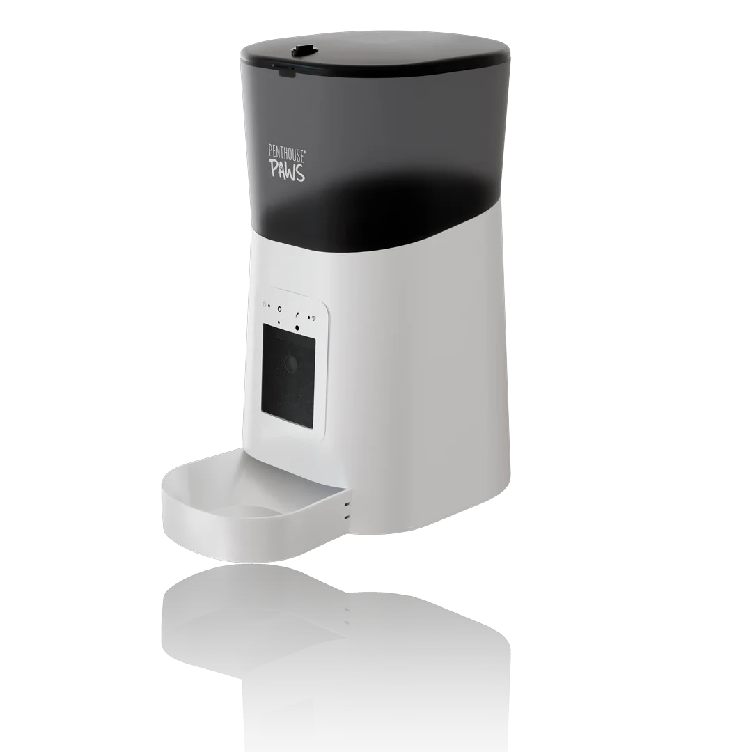
A white background product render looks pasted in for three reasons, almost every time. There's no proper contact shadow, the product gets no bounce light from the floor, and the white isn't really white: it's a pale grey that someone pushed with levels until the edges went crunchy. Fix those three and a render on pure #FFFFFF sits on the page like a studio photo. Skip any of them and buyers notice, even if they couldn't tell you why.
I do a lot of these. Most of my Amazon listing images and A+ content renders start with the white main image, because that's the one the marketplace forces on you. Here's how I set them up in Blender Cycles, with the numbers I actually use.
Why pure white is harder than it sounds
Amazon wants the main image on pure white, RGB 255, 255, 255, with the product filling roughly 85% of the frame. Plenty of other shops and comparison sites copy that rule. The catch is that a physically lit scene almost never produces 255 anywhere except blown highlights. A real white sweep in a real studio reads somewhere around 235 to 245 straight off the camera, and the photographer clips it to 255 later.
So you're always faking something. The only question is where, isn't it?
The lazy version is to render on transparent, drop the cutout onto a white canvas and call it done. That's the pasted look in its purest form. The object floats because nothing underneath reacts to it: no shadow, no bounce, no soft darkening where the base meets the floor. Your eye reads it as a sticker within half a second, and a sticker doesn't feel like something you can hold, which is the whole point of a main image.
The contact shadow does most of the work
If I could keep only one thing, it would be the contact shadow. I don't mean the long dramatic cast shadow from the key light. I mean the small dark band right where the product touches the ground, usually only 2 to 6 mm wide at real-world scale for something the size of a kettle.
In Cycles I get it with a shadow catcher plane under the product, then a big soft key light from above and slightly to the left (about three to four times the product's width), plus a weaker top light. The shadow catcher hands me an alpha channel that holds only the shadow, which I lay over white in the compositor.
Ambient occlusion alone isn't enough.
It darkens the corner, sure, but it has no direction, and a product with a directionless shadow looks like it's standing under an overcast sky indoors. That's a strange place for a coffee grinder. I keep the shadow light: around 15 to 30% opacity at its darkest point under the base, fading to nothing within roughly a third of the product's height. Heavier than that and the image looks dirty on a white page. Lighter, and you're back to floating.
Bounce light from a floor that isn't there
This is the one most people miss. In a real studio the white sweep under the product throws light back up. The lower third of a black appliance picks up a faint grey sheen, a glossy bottle shows a bright band along its base, a matte plastic housing gets lifted a little from below. Delete the floor and that bounce disappears with it, and the bottom of the product goes muddy.
My fix is boring. I keep a real white floor plane in the scene for lighting, with a diffuse white of about 0.8 albedo, and hide it from the camera using ray visibility. The product still sees it in reflections and still gets the bounce, while the camera only sees the shadow catcher.
Last year a small appliance brand sent back a set of my white background renders because the black base "looked cut out". They were right. I'd hidden the floor completely to save render time, and putting it back cost about 20 seconds per frame at 2,000 px. The complaint went away and I haven't skipped that plane since.
Getting to 255 without wrecking the edges
Now the white has to actually be white.
The thing to avoid is a global exposure or levels push on the finished image. That does clip the background to 255, but it also clips the highlights on the product, flattens white plastic into paper and eats the soft tail of the shadow. You end up with a hard grey smudge under a product that looks overexposed. I've seen agencies do this to otherwise decent renders and then wonder why the set feels cheap.
Instead I composite in layers. The product pass keeps its own alpha, the shadow catcher pass gets multiplied over a flat 255 white, and the product sits on top. The product's exposure stays wherever it looks right, and the background is 255 by construction rather than by force. Then I check it with a colour picker in all four corners and right next to the shadow, because a faint gradient of 250 to 252 near the product is exactly the kind of thing that gets an image flagged on stricter marketplaces, in my experience.
White products are the nasty case. A white kettle on a white page has no edge at all if you light it flat. I give it a slightly cooler key, keep the brightest areas of the body around 225 to 240 so it never touches the background value, and let the shadow plus a thin rim of darker reflection define the outline. If the product body hits 255 anywhere, that part simply dissolves into the page.
Mistakes behind most pasted-looking renders
- A shadow from a different light. The highlight on the product says the key is on the left, but the shadow also falls to the left. People feel it even when they can't name it.
- Edge halos. A light fringe around a dark product, usually from mixing premultiplied and straight alpha. Zoom to 300% on the edges before anything leaves your machine.
- A gap under the product. The CAD origin wasn't at the base, so the model hovers 0.5 mm above the floor and the shadow catcher draws a thin bright line under it.
- Reflections of nothing. Glossy surfaces reflect the world. If the world is black, chrome looks like a hole. I use a plain studio HDRI at about 0.3 strength, for reflections only.
- Too wide a lens. A 24 mm camera close to a small product bends it. I sit at 80 to 120 mm and move the camera back.
The counter-intuitive one: a white background usually needs more lighting work than a styled lifestyle scene, not less. A kitchen set hides a lot behind props and depth of field. A white page hides nothing at all.
What I'd actually do for a listing set
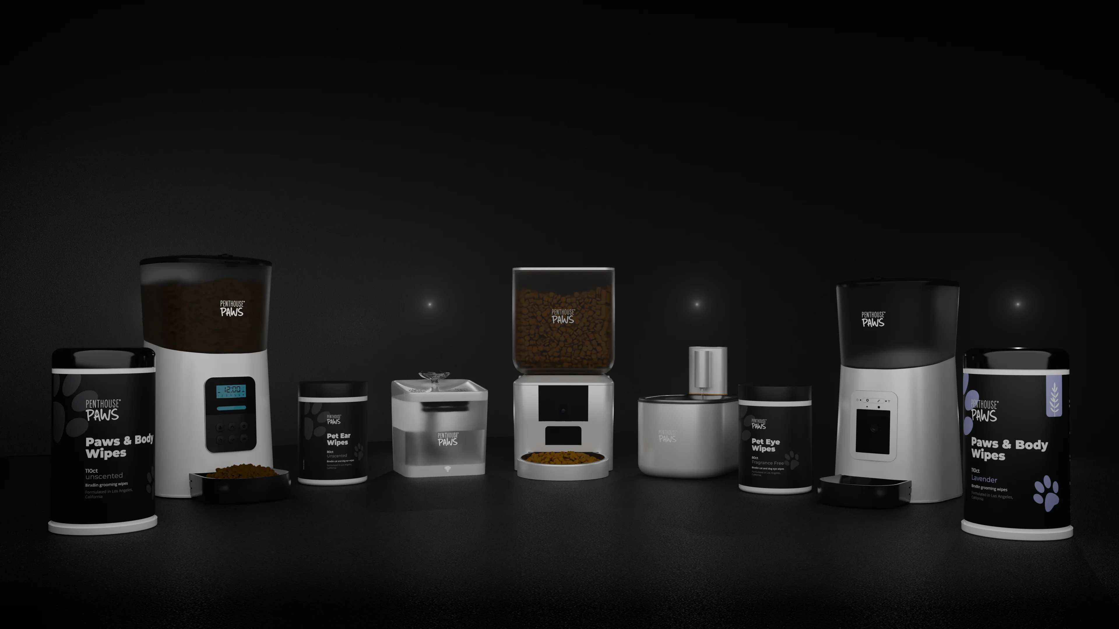
For a typical listing I build one lighting rig and reuse it for every white shot: key, top, a weak fill from the right, the invisible white floor, the shadow catcher and the low-strength HDRI. I render at 3,000 px on the long side, since marketplaces zoom from around 1,000 px and you want headroom for crops, with the product filling about 85% of the frame. Around 512 samples with denoising is plenty for a clean white scene (I explained why in my note on Cycles samples), and the general rig is the one from my studio lighting notes.
The secondary images, other angles, close-ups, the in-box shot, then come off that same rig in an afternoon. And they match. That consistency across seven images does more for a listing than any single heroic hero shot.
One more habit worth stealing: keep the layered files. When a marketplace changes a rule, or the website team wants a light grey background instead of white, you re-comp in five minutes rather than re-rendering everything from scratch.
If you've got a CAD model and a listing deadline, send it through the contact form and I'll tell you honestly what the white shots need. There are more examples on my 3D product rendering page.