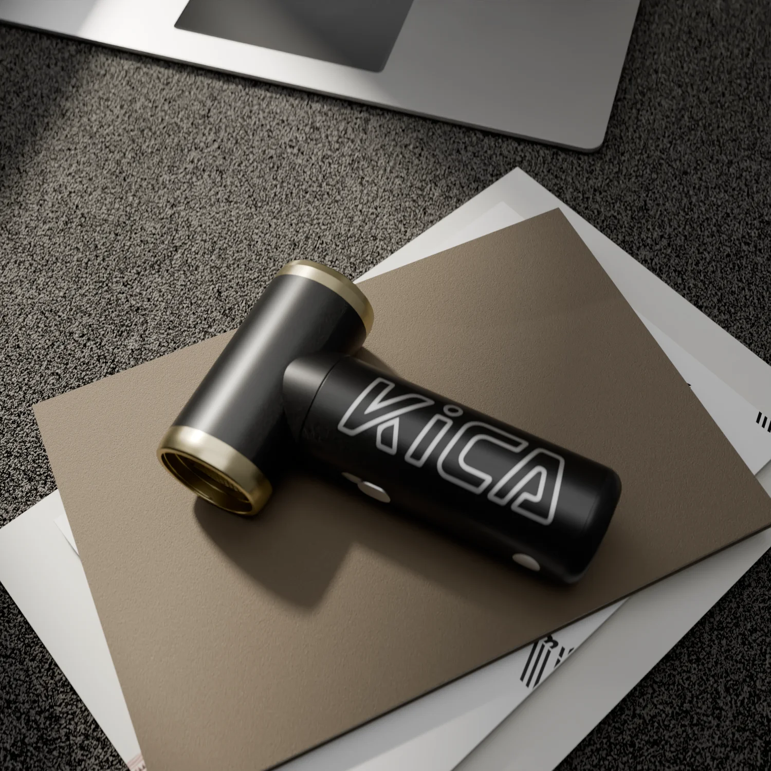
Backers trust renders that look like a product someone has actually tried to build. They don't trust renders that look like a perfume advert. That's the short version, and after a fair number of crowdfunding jobs I'd go further: the most convincing Kickstarter product renders are usually a little less glamorous than the founder wanted, and a lot more specific. Visible screws. A real cable. A seam line where the two halves of the housing meet.
Crowdfunding backers have been burned. Plenty of them have paid for a gadget in year one and received an apology email in year three, so they read campaign images the way an engineer reads a drawing, looking for the thing that doesn't add up.
What backers actually read in a render
I've watched people scroll through campaign pages (friends, mostly, and a couple of product designers I trust), and the pattern is boringly consistent. They skim the hero image, then they go straight to anything that shows how the thing works: cross-sections, exploded views, a hand holding it, the charging port. If those images exist and they agree with each other, trust goes up. If the hero shot shows a glossy shell without a single split line and nothing else, people assume nobody has figured out the inside yet.
Details that read as honest:
- Parting lines and screw bosses that match how the part would really be moulded.
- Materials with believable texture, like a light spark-eroded finish on ABS instead of perfect mirror plastic.
- Scale cues: a hand, a desk, a mug, a standard USB-C plug next to the port.
- The same colour and geometry in every image, so nothing looks like it was redesigned between shots.
- An exploded view where the parts could plausibly fit together.
That last one matters more than most founders expect. An exploded view rendering is basically a promise that the assembly exists. When the battery, PCB and housing in the exploded view are the actual CAD bodies, sized correctly, people notice, even if they couldn't tell you why.
What makes backers suspicious
Too much perfection.
Infinite white floors with no contact shadow, chrome on everything, a product floating at a jaunty angle with lens flares behind it. Each of those is fine on its own in a retail catalogue, but on a campaign page for a product that doesn't ship for ten months, it looks like you're hiding something. The other big one is inconsistency. I once got a brief from a small hardware startup with a desk lamp where the marketing renders had been made by one person from a sketch and the engineering CAD by another, and the two lamps had different arm lengths by about 40 mm. Nobody on the team had noticed, but a backer comparing the hero image to the dimensions graphic would have, within seconds.
And then there's the rule side of it. Kickstarter's hardware and product design rules expect you to show a working prototype in its current state, and its help pages have long been strict about photorealistic renderings that pass for a finished product. Read the current rules for hardware projects before you plan the image set, because they change, and the reviewer's reading of "too realistic" isn't something you want to argue with in launch week.
Prototype photos and renders do different jobs
This is the bit people get backwards. They think the renders replace the prototype photos. They don't. The prototype photo, even an ugly 3D-printed one with sanded supports, proves the thing exists. The render explains the version you're going to ship. Put them side by side and label them plainly ("prototype, March" and "production design, render") and you get the best of both: honesty and clarity.
A good campaign page usually has something like six to ten images. My rough split would be two or three real prototype photos, one hero render, one or two exploded or cutaway renders, two lifestyle renders showing scale and use, and a couple of feature callouts. Animated GIFs of a mechanism are worth their weight. A 4-second loop of a hinge opening explains more than a paragraph of copy, and it's cheap to produce once the model is rigged.
Build the renders from the real CAD
I'm a mechanical engineer before I'm a visualiser, so I'm biased here, but I think this is the single biggest trust factor. When the renders come from the same Fusion 360 or STEP model that the factory quote is based on, everything lines up: dimensions, part splits, fasteners, the gap around the button. You can show a section view and it's true.
When a render artist builds a separate pretty model from a sketch, you get a lovely object that can't be manufactured as drawn. Wall thicknesses of 0.5 mm. Rounded corners that no mould could produce without a slide. A battery that would need to be half its real size to fit.
Last spring a founder sent me a beautiful concept model of a handheld device and asked for campaign renders. Before rendering anything I checked it against their electronics list, and the internal volume was short by roughly a third once the PCB, a 2,000 mAh cell and the USB-C board were placed. We spent two days on rough packaging in CAD first. The renders that came out of that were slightly chunkier than the concept, and the founder was disappointed for about a day, then relieved, because the version they showed backers was the version they could actually make. That's the work I do as a product development engineer as much as a renderer, and frankly it's the part that protects the campaign.
Common mistakes I see on campaign pages
The most common one is spending the whole image budget on one perfect hero shot and leaving the rest to phone photos of a prototype taken under a kitchen light. The second is promising colours you haven't sampled. Rendering a product in six colourways is easy (it's a material swap and an overnight render queue), but if your moulder hasn't matched those colours yet, you're setting up a stretch-goal argument later. Show the colours you're confident in.
Another one, slightly counter-intuitive: the renders are often too clean in the wrong places and too dirty in the right ones. Founders ask for fingerprints and dust "for realism", but the surfaces backers check are the functional ones, so I'd rather see an accurate port, a real gasket and a believable texture than artificial smudges.
Resolution is the last trap. Kickstarter pages display images fairly small, so I render the hero at around 3000 px wide and the supporting images at 2000 px, which leaves room to crop for social posts and press kits without paying for 8K frames nobody will ever see at full size.
What I'd actually do for a campaign
If I were launching a hardware product tomorrow, here's the order I'd work in. Freeze the CAD to the point where the outer shape won't change, even if the internals are still moving. Print or machine one prototype and photograph it honestly. Then render from that same CAD: one hero, one exploded view, one cutaway of whatever makes the product clever, two in-context shots with a human hand, and a short loop of the main mechanism. Label everything.
Would that page look as slick as the overproduced campaigns? Probably not. Would it get more questions answered before backers go looking for them in the comments? Yes, and in my experience that's what converts the cautious backer who's been let down before.
Timing matters too. Give the render work at least two weeks before launch, not two days. A first draft usually leads to one round of "can the light be warmer" and one round of "actually the button moved", and both are normal. Rushing them is how inconsistencies sneak in.
If you've got a CAD model and a launch date, have a look at how I handle Kickstarter product renders from CAD and the wider 3D product rendering work, then send me the files. I'll tell you honestly whether the model is ready to render or needs a few days of engineering first.