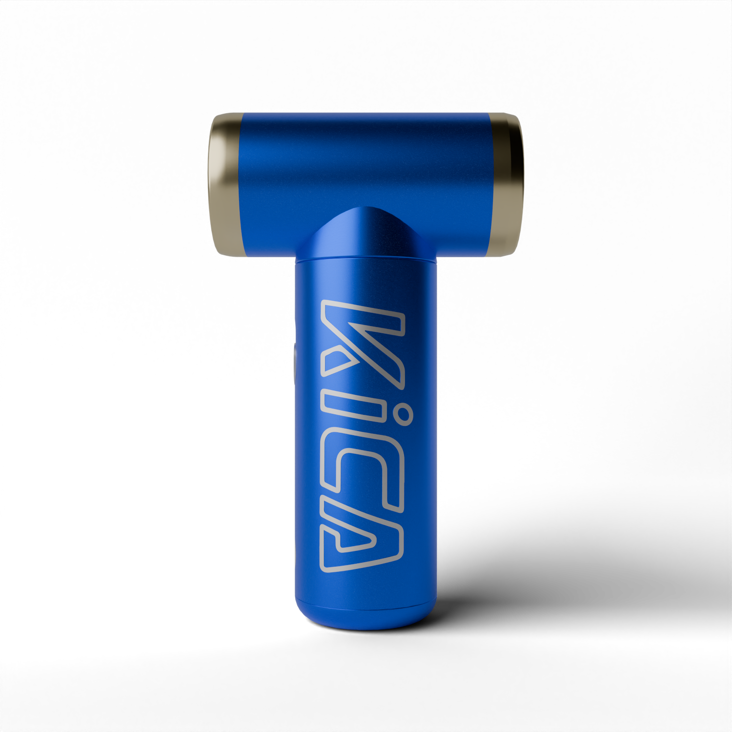
For HDRI lighting in product rendering I use three maps, and I've used the same three for about two years: a plain studio with one large softbox, an overcast sky, and a daylight room with tall windows. Between them they cover matte plastic, brushed metal, glass and painted surfaces. Everything else in my library gets opened twice a year.
Picking the map is maybe a fifth of the job. Rotating it, dimming it and deciding what the camera is allowed to see is the rest, and that's what this article is mostly about.
What an HDRI does in a product shot, and what it doesn't
An HDRI is a 360 degree photograph that stores real brightness values, so a window in it is thousands of times brighter than the wall next to it. Wrap it around a scene and you get two things at once: light arriving from every direction, and something for shiny surfaces to reflect.
The second one matters more.
A chrome tap or a glossy phone back has no colour of its own to speak of. What you see is the room. Put that object in an empty scene with three area lights and it reflects three white rectangles floating in black, which is exactly what a cheap render looks like. An HDRI fills the black with a believable world, and the product suddenly sits somewhere.
What an HDRI doesn't do well is shape. Light coming evenly from all sides flattens form, kills the shadow under the product and makes every edge equally bright. That's why I almost never light with an HDRI alone.
Map one: a studio with a single big softbox
This is my default for anything on a white or grey backdrop: enclosures, small appliances, packaging, tools. The map is a dark studio with one large rectangular light and not much else. On a curved surface that rectangle becomes one long clean highlight with soft ends, which is the look of every catalogue photo you've seen.
I run it at a strength of 0.4 to 0.6 in Blender and rotate it until the highlight lands along the edge I want to describe. Then I add one or two area lights of my own for the key and the rim, as I describe in the studio lighting article. The HDRI is the fill and the reflections. The lights do the modelling.
The reason I prefer a nearly empty studio map over a busy one with six softboxes, stands and a ceiling grid is that busy maps print themselves onto the product. You end up with a tripod reflected in a kettle.
Map two: an overcast sky
A fully clouded sky is the largest softbox there is. No sun disc, no hard shadow, just a smooth gradient from bright overhead to darker at the horizon. I use it for matte and satin materials where a studio highlight would look too deliberate: textiles, moulded plastic with a fine texture, wood, rubber grips, anything meant to feel like it's outdoors without showing an outdoor scene.
It has one trap. Most sky maps were shot standing on grass, and the lower half of the sphere is green. That green bounces up into the underside of a white product and gives it a faint sickly tint that people notice without being able to name. I fix it in the shader: a Hue/Saturation node between the Environment Texture and the Background, with saturation pulled down to about 0.2. The light stays, the colour cast goes.
Last winter a founder sent me a stainless water bottle to render for a shop page, and the first preview came back with the comment that the steel looked "a bit cheap". The model was fine and so was the material. The sky map behind the camera had a row of trees in it, and brushed steel was faithfully reflecting them as a muddy band across the middle of the bottle. I desaturated the map, blurred it slightly and turned it 40 degrees. Same bottle, and no further comments on the steel.
Map three: a room with tall windows
Glass, liquids, lacquer and polished metal need reflections with edges. A window gives you that: a bright vertical rectangle with mullions, repeated two or three times, which reads instantly as "real room" in the curve of a bottle or the bevel of a watch case. I keep one map of a plain white loft with windows on one side only, so there's a bright side and a dark side to work with.
For this map resolution starts to matter, and it's the only one of the three where it does.
Resolution: 4K is enough more often than you'd think
Does a bigger map give better light? No. The lighting an HDRI produces is practically the same at 1K as at 16K. Diffuse light is an average of the whole sphere, and averaging doesn't care about detail. What changes with resolution is the sharpness of mirror reflections and of the background, if the camera sees it.
So my rule is simple. Matte and satin products get a 2K or 4K map. Mirror-like chrome and clear glass get 8K, because a blurry window frame in a sharp reflection gives the game away. I load 16K only when the map is also the visible backdrop, which in product work is rare. A 16K EXR is several hundred megabytes, it eats GPU memory that the scene could use, and on a satin plastic housing nobody could tell the difference in a side-by-side.
Here's the counter-intuitive part: for matte products I often blur the map on purpose. A small amount of blur removes the tiny bright details (a lamp, a gap in the clouds) that cause fireflies and uneven noise, and the render cleans up faster. If you've read my notes on how many Cycles samples a product render needs, this is one of the cheapest ways to need fewer.
Rotation and strength beat a new map
When a render looks wrong, the instinct is to try another HDRI.
Resist it, and turn the one you have.
In Blender that means a Mapping node in front of the Environment Texture and the Z rotation. I go round in 15 degree steps with the viewport in rendered mode and watch one thing only: where the brightest highlight sits on the main surface. On a typical enclosure there are two or three positions out of twenty-four that look right, and they're usually ones where the highlight runs along a long edge and falls off before the corner. KeyShot does the same thing with a rotation slider and lets you pin extra lights onto the map, which is faster for quick studies.
Strength is the other half. A map at 1.0 with studio lights on top gives a washed-out picture with grey shadows. I start at 0.5, set my key light, and then bring the map down until the shadow under the product has some weight again.
Keeping the HDRI out of the picture
For a white background product render the camera shouldn't see the map at all. There are two clean ways to do it in Cycles. Film > Transparent renders the product on alpha and you place the backdrop later. Or you split the world shader with a Light Path node, using Is Camera Ray to show the camera a flat colour while everything else still receives the HDRI.
I use the second one when I've built a floor and backdrop in the scene, because the product then gets a real contact shadow and a little bounce from the surface it stands on. Transparent film is quicker, and fine for cut-outs.
One more setting worth knowing: if the map contains a small, very bright source, clamp indirect light to around 10. You lose a trace of realism in the highlights and you get rid of the white speckles that no sample count will remove.
What I'd actually do on a new product
Start with the studio softbox map at 0.5 and no other lights. Rotate until the main highlight is in a good place. That's ten minutes, and it already tells you whether the materials are right, since a material that looks wrong under a plain softbox is wrong, full stop.
Then add a key light and judge the shadow. Then, only if the product is glass, liquid or polished metal, swap to the window room at 8K and rotate again. If the product is matte and the picture feels too much like a studio, try the overcast sky with the saturation down.
- Studio softbox, 4K, strength 0.4 to 0.6: hard goods on plain backdrops.
- Overcast sky, 2K to 4K, saturation 0.2: matte, textile, wood, rubber.
- Window room, 8K: glass, liquid, lacquer, chrome.
Good free maps of all three kinds are on Poly Haven under a CC0 licence, so there's no reason to pay for a pack of 200 before a specific job asks for it.
And if a render still looks flat after all that, the problem is rarely the HDRI: it's usually a material with no roughness variation or an edge with no bevel, and no map fixes those.
If you've got a CAD model and want it lit properly without learning all this, that's the core of my 3D product rendering work, and the wider product visualization page shows what the finished sets look like. Send the file and a reference photo you like through the contact form and I'll tell you honestly what it needs.