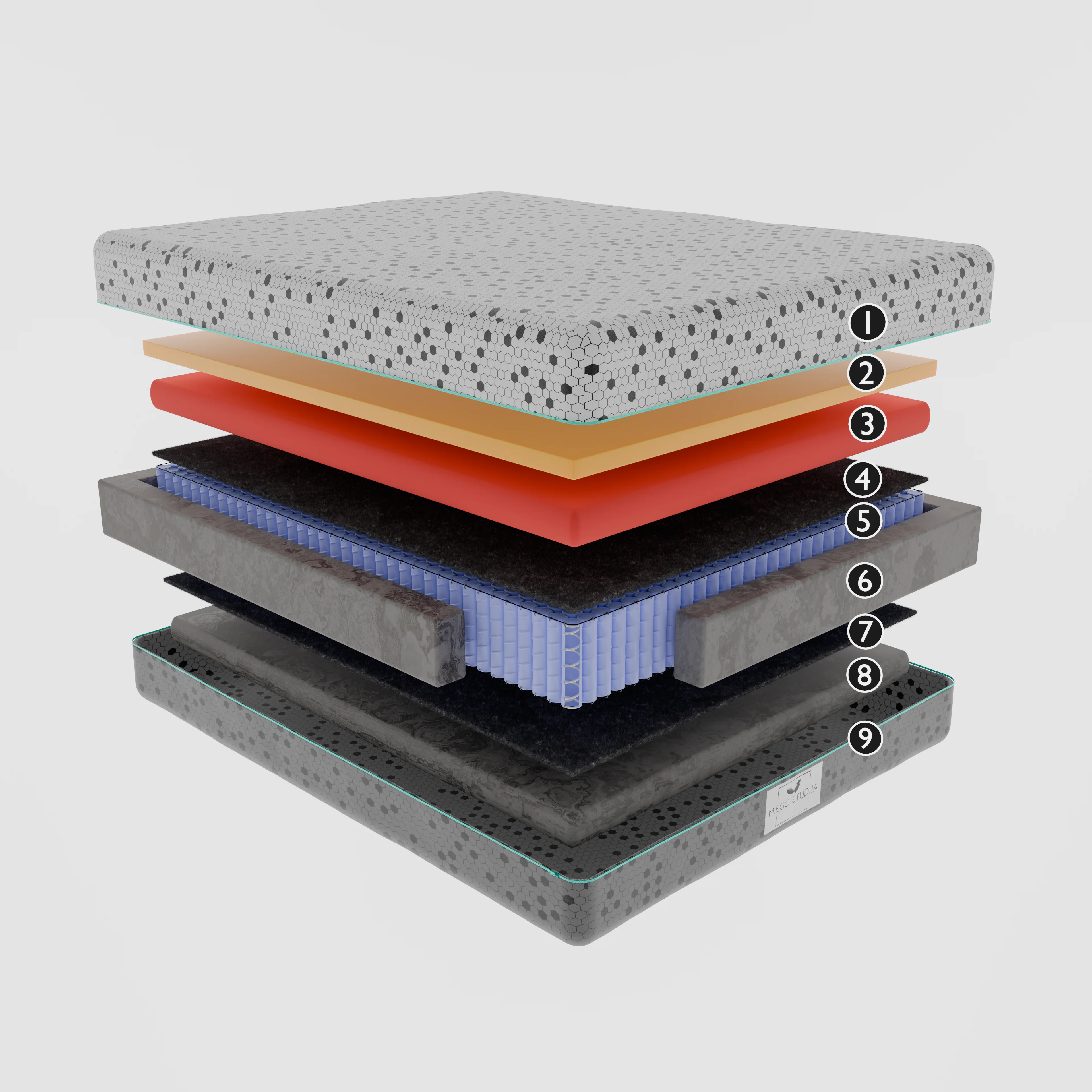
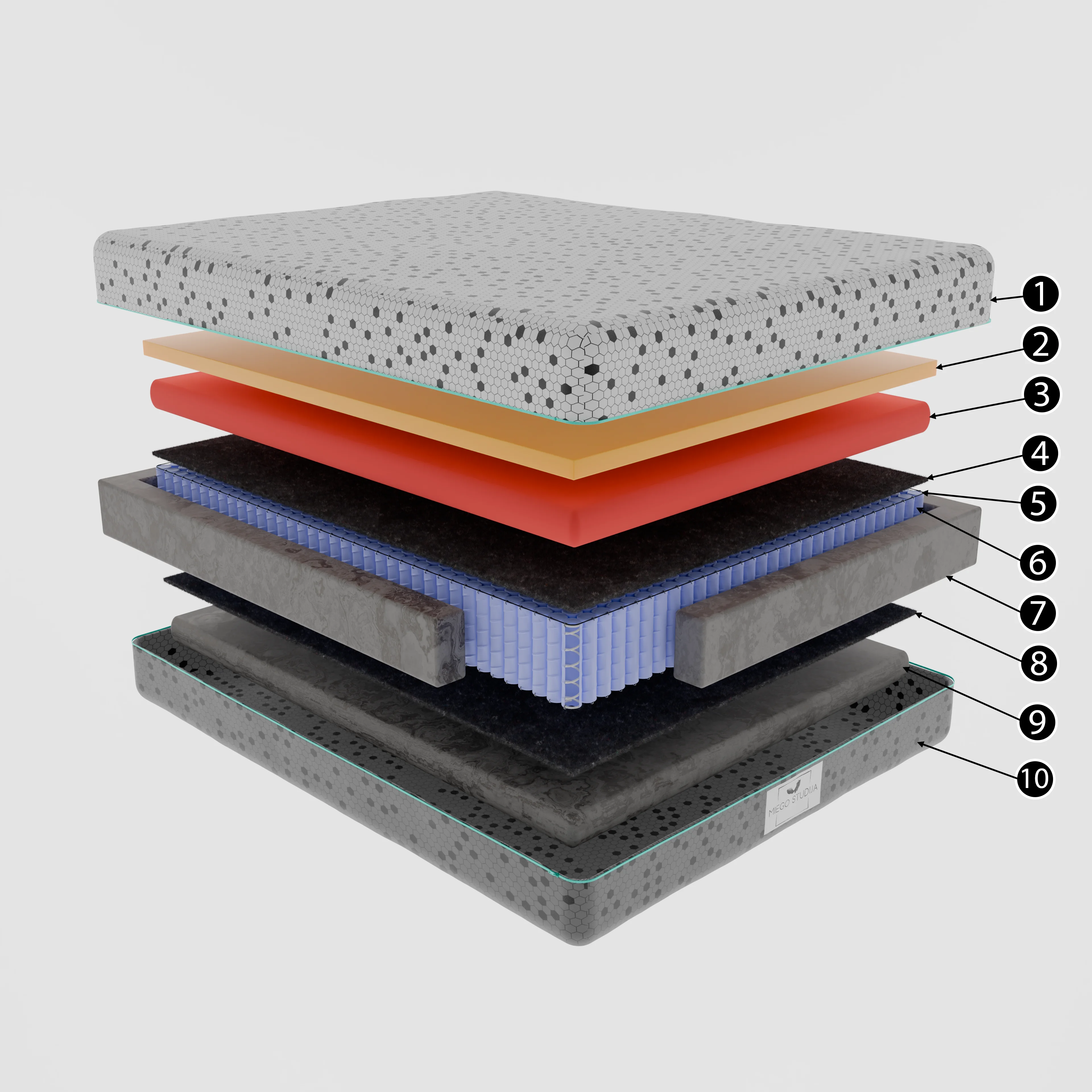
A mattress exploded view render works when a shopper can count the layers in under two seconds and tell them apart without reading a single label. That's the whole brief. Most of the ones I see online fail it, not because the modelling is bad but because five foams that are all off-white end up looking like a slice of grey cake.
I've done a fair few of these for bedding brands and the problems repeat, so here's how I set them up, with the numbers I actually use.
Why mattress layers are harder than they look
A sensor enclosure explodes nicely because every part has a different shape. A mattress doesn't. It's a stack of rectangles, each roughly 1,600 by 2,000 mm, and the only things separating a 50 mm memory foam layer from a 30 mm transition foam are thickness, a slightly different cell structure and maybe a tint. Strip away the marketing colours and you've got slabs.
That means the information has to come from somewhere other than silhouette. I use four levers: spacing, edge detail, surface texture and colour. Pull all four and it reads. Pull one and you get the cake.
Spacing: how far apart the layers should float
My starting rule is a gap of roughly 0.6 to 0.8 times the thickness of the thickest foam layer, kept constant through the stack. With a 200 mm pocket spring unit at the bottom that rule breaks down, so in practice I cap the gap at around 80 to 120 mm in scene scale and let the spring unit be the visual anchor.
Constant matters more than the exact figure. Uneven gaps make people assume some layers are bonded together and others aren't (which might be true, but then it should be a deliberate choice you show, not an accident of dragging objects around in the viewport). I snap every layer to a fixed offset in Blender rather than placing them by eye. It takes a minute, and it's the first thing I check when a stack feels off.
Should the layers fan out, like a deck of cards? Sometimes. A slight stagger, each layer shifted 40 or 50 mm towards the camera, shows the edge of every slab at once, and it's my default for ecommerce. For a technical spec sheet I keep them perfectly vertical, because the stagger can read as the layers being different sizes.
Camera angle and the edge that does all the work
The edge is where foam tells its story. Memory foam has a fine, dense cell edge. Latex has its pinholes. Pocket springs need the fabric pockets visible, and the cover needs its quilting and a bit of softness at the corner.
So the camera goes low and to a corner, about 20 to 25 degrees above the top surface and 30 to 40 degrees off the long side. Higher than that and you're looking at five tops, which are identical. I use a fairly long lens, around 70 to 85 mm equivalent, so the stack doesn't distort into a wedge. A 50 mm lens at the same framing makes the top layer look noticeably bigger than the bottom one, which is the wrong message for a product where every layer is the same size.
One thing people don't expect: the corner nearest the camera should be slightly rounded on every foam layer, maybe a 3 to 5 mm bevel. Real cut foam isn't razor sharp, and a hard 90 degree edge catches a thin white highlight that turns the whole thing into plastic.
Foam textures that read at thumbnail size
Here's the counter-intuitive bit.
The realistic foam texture, the one scanned from a real sample at 4K, usually hurts. At the 600 px width a marketplace thumbnail shows, fine cell structure turns into noise, and noise looks like dirt.
I build foam from a procedural Voronoi and noise pattern in Blender, then exaggerate the scale until the cells are about two to three times larger than reality. Up close it looks a touch coarse. At thumbnail size it finally reads as foam. I check every material at 25% zoom before I check it at 100%, which is the opposite of how most people work.
Displacement on the cut edges helps too, but only on the edges. Putting it on the top faces adds render time (on a 4,000 px still I've watched it go from 6 minutes to 14 in Cycles) and nobody can see the difference.
Colour: honest tints versus brand colours
Most foams are some shade of cream, white or pale grey. Some brands dye a layer blue or green for a cooling gel, and that's a gift for the render. When they don't, I have to decide whether to tint layers that aren't actually tinted. That's less straightforward than it sounds.
My position is that a small, consistent tint is fine for a technical exploded view as long as the product page also has a real photo. Each layer gets a lightness step of about 8 to 12% so they separate even in greyscale. I don't invent a bright purple layer that isn't there. A customer who unzips the cover and finds a different colour feels misled, and that ends up in reviews.
Last spring a bedding startup sent me a CAD stack where three of the five layers had exactly the same white. We agreed on a warm-to-cool step instead, top layer slightly warm, bottom slightly cool, and their gel layer kept its real blue. Nobody had to pretend anything. It took one email and about twenty minutes of material tweaks.
Labels, callouts and the text you'll regret
Leave labels out of the render itself. Always.
I deliver the clean image plus a guide layer with leader line positions, so the client's designer can set type in their own font. Baked-in text can't be translated, can't be edited when the foam supplier changes, and goes blurry when the marketplace recompresses the JPEG. A mattress range sold in four countries needs four label sets, and the render shouldn't care which one it gets. I once had a foam supplier change two weeks after launch, and only the label layer needed redoing.
If the client insists on text in the image, I keep it to the layer name and thickness, "Memory foam 50 mm", and nothing like "cloud comfort technology". Marketing copy on an exploded diagram undermines the one thing the diagram is for, which is looking factual.
What I'd actually do for a new mattress line
For a typical range of three models that share most layers, I'd build one master scene with every layer as its own object and its own material, then make each model a collection. The hero explode, the cut-corner shot and the plain assembled shot all come from the same file, and a change to the latex material updates every image at once.
- One staggered corner explode per model at 4,000 px for the product page.
- One vertical technical stack for spec sheets and retailer PDFs.
- A square crop of each for marketplace thumbnails, checked at 600 px.
- A label guide layer, with no baked text.
The mistake I'd avoid above everything else is rendering the stack before the layer thicknesses are confirmed. Foam suppliers change specs mid-project more often than you'd think, and a 10 mm change in one layer shifts every gap above it, which means re-checking every camera.
Get the spec sheet signed off first. Then model.
There's a broader write-up on how I build exploded view renders in general, and the mattress work sits under my exploded view rendering service. If the images are going onto a marketplace listing, the page on Amazon listing images and A+ content renders covers sizing and the shots that usually go alongside, and the wider 3D product rendering page shows the rest of what I do.
If you've got a layer spec and a CAD file, or even a dimensioned sketch, send it over and I'll tell you honestly what the stack needs to read well.