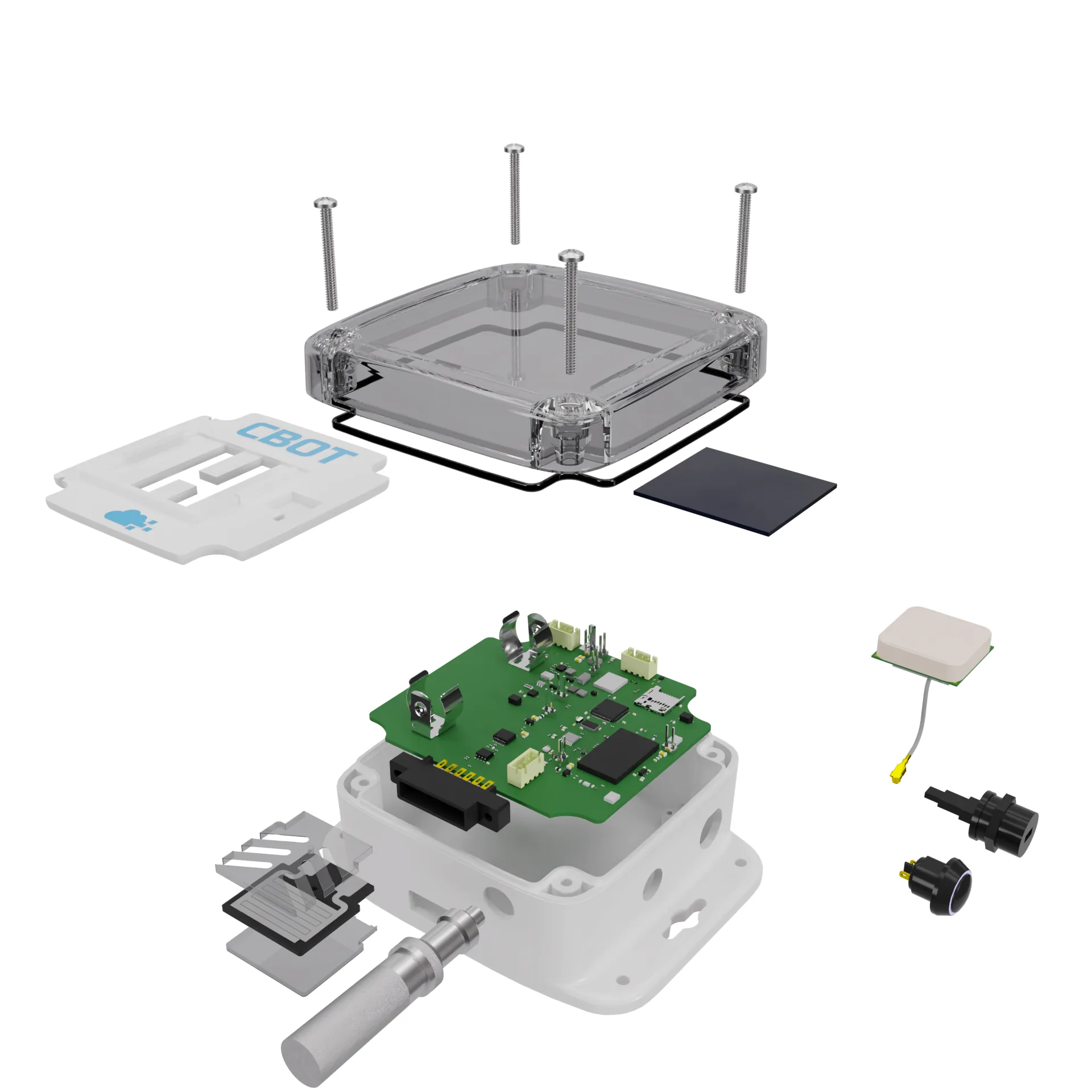
An exploded view for assembly instructions should show one thing per step: the part being added, the part it goes onto, and the direction it travels. Everything else on the screen is noise, and most bad manuals I've seen fail because they show the whole product blown apart in one picture and leave the reader to work out the order.
That's the short answer. The longer one is about deciding, part by part, what earns a place in the image.
A marketing explode and a manual explode are different jobs
I make both, and clients often ask for one when they need the other. A marketing explode is a hero image. Every layer floats in a neat stack, the lighting is moody, the screws hover like little satellites, and the whole point is to say "look how much engineering is inside." It's fine for that.
A manual explode has to be read by someone kneeling on a floor with an Allen key, probably tired, possibly annoyed. They don't care how pretty it is. They want to know which bag the screws come from and whether the bracket goes on before or after the panel.
So the rules flip. In a marketing image I'll spread parts generously and let the camera find a dramatic three-quarter angle. In a manual I keep the separation distance small (often only one or two part thicknesses) so the eye can still see where each piece lands, and I pick a camera angle that stays the same for as many steps as possible. If the view rotates between step 4 and step 5, half your readers will think they've turned the product over.
I've written separately about how I build exploded view renders from CAD, so I'll skip the modelling side here and stay on the editorial decisions.
What I always show
For each step, the minimum set is the new part, its mating part, the fasteners that join them, and an arrow or a dashed line for the path. That's it. Four things.
The mating part matters more than people think. If step 6 adds a lid, I don't show the whole assembled enclosure in full colour behind it. I show the base the lid sits on, because that's where the screw holes and the alignment features are. The rest of the product can be greyed out or dropped entirely.
Fasteners get their own treatment. I show every screw that's used in that step, at its real size, with the head facing the direction it'll be driven from. A count label next to it ("4×") saves a surprising number of support emails. If two screws look alike but differ by 2 mm in length, I'll put a 1:1 silhouette in the corner of the page so people can hold the screw against the paper. That trick costs me about ten minutes and it's the single most useful thing I add.
Orientation cues are the last item. A small arrow marked "front", or a visible logo, or the cable exit. Something that tells the reader which way round they're holding the thing.
What I hide, and why it's usually more than you'd expect
Hiding is where the real work is.
Internal parts that come pre-assembled go. If the PCB arrives already screwed into the housing, it doesn't belong in a consumer manual, even if it's the most interesting thing in the CAD. Same for pressed-in bushings, glued magnets, factory-fitted gaskets and anything with a warranty sticker over it. Showing them invites people to take them apart.
Parts from earlier steps get faded or removed. My default is about 30% opacity in a neutral grey for anything already fitted, and I drop it completely once it's two or three steps back and no longer touching the new part. A sealed sensor enclosure I worked on had 23 parts in the CAD tree. The customer-facing manual ended up showing nine of them across five steps, and nobody missed the other fourteen.
Fine detail on the geometry often goes as well. Knurling, text embossed on the inside of a housing, tiny chamfers, mould ejector marks. At the print size of a typical A5 manual they turn into grey fuzz, and fuzz makes line drawings look dirty.
Should you hide cables? Usually, until the step where they get plugged in. Then show them fully, with the connector at a readable size, because connectors are where people break things.
Render or line drawing?
This comes up on almost every manual job. Photoreal renders look great on a website and on the box. In a printed manual they're often worse than a clean line drawing, especially when the print is one colour or the paper is cheap. Dark plastics turn into black blobs, and soft shadows eat the edges you need the reader to see.
My usual approach in Blender is a hybrid: flat or lightly shaded fills, a Freestyle outline around every part at about 1.5 px at 300 dpi output, and one accent colour reserved for the part being added in that step. Everything else stays grey. The accent colour does more teaching than any arrow.
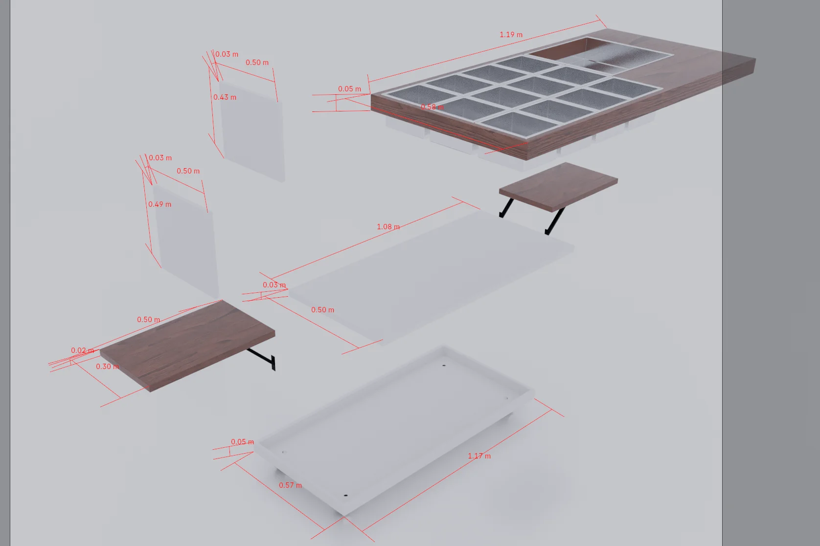
For a website or a crowdfunding page I'll still do the full render. The same scene file feeds both, which is the main reason I build manuals from the CAD rather than redrawing them in Illustrator.
Mistakes I see in nearly every first draft
A few come back again and again, including in my own early work:
- Too much separation. Parts float so far apart that the reader can't tell which hole a screw goes into. If the gap is bigger than the part itself, it's usually too big.
- Everything in one picture. A single explode of a 40-part product is a parts catalogue, not an instruction.
- Arrows that point the wrong way, because someone drew them pointing away from the part (the explode direction) rather than toward it (the assembly direction).
- Camera angles chosen per step to "look best", which forces the reader to re-orient every page.
- Hardware drawn at a guessed size instead of from the real fastener model.
The arrows one is sneakier than it sounds. In CAD the explode is created by pulling parts outward, so the natural instinct is to draw the arrow in that direction. The reader needs the reverse. I've caught it in my own files more than once.
The counter-intuitive one is this: fewer steps aren't always friendlier. Clients often ask me to squeeze a manual into four pages. Combining three operations into one image saves paper and creates confusion, and confusion means returns. A ten-step manual where each image has one idea is easier than a four-step one where each image has three.
A quick story about a mattress
Last year I did exploded views for a layered mattress, the kind with a foam base, a pocket spring unit, two comfort layers and a zipped cover. The marketing version was easy: stack the layers, spread them vertically, light it softly. The brand loved it.
Then they asked whether the same image could go in the box insert that tells people how to fit a replacement topper. It couldn't. The customer never sees the spring unit, and showing it made the job look like surgery. The insert version showed exactly two things: the cover, half unzipped, and the topper sliding in, with one arrow. It took me less time than the hero image and it was probably more useful.
What I'd actually do for a new product
Start from the real assembly sequence, not the CAD tree. Walk through the build with whoever assembles the prototypes and write the steps down in plain words first: "fit the two side brackets with 4 M4×10 screws, flat face outward." If you can't write the step in one sentence, it's two steps.
Then lock a camera. One main angle for the whole manual, plus a second one only when a step happens on the underside. Build the explode per step, show the new part in the accent colour, fade the rest, and check every page at actual print size. I print a test page on an ordinary office printer before sending anything. If it reads on that, it'll read anywhere.
Finally, keep the separation tight and let the arrows do the explaining. You're aiming for a picture a tired person can follow without reading the text at all.
If you've got a STEP model and a rough step list, I can turn it into a manual-ready set alongside any marketing images you need. My exploded view rendering page shows the kind of output, and if the product is still moving from prototype to production, the product development engineer side of my work covers the assembly sequence itself. Send the files through the contact form and I'll tell you honestly how many steps it really needs.